Scroll interaction
Synchronizing animated visual elements with the reader’s scroll.
Frontend development for a distinctive black-and-gold corporate website, with scroll-driven motion and reusable page templates.

Venus is a corporate website with a high-contrast black-and-gold visual identity. My role was to turn the supplied interface designs into responsive frontend pages, including a motion-driven landing experience, a portfolio, and editorial and company templates.
I worked on the frontend implementation only: translating UI designs into React components, building scroll-based interactions, and adapting layouts across screen sizes. The visuals shown here document that frontend work.
Explore technologies & implementation ↓Synchronizing animated visual elements with the reader’s scroll.
Adapting highly decorative sections to different screen dimensions.
Handling media-heavy scenes and transitions without losing usability.
Keeping many different screen types coherent and maintainable.
A categorized view of the original frontend stack, followed by one verified detail of its scroll implementation.
A period-accurate overview drawn from the archived project. Only tools with source evidence are listed; empty categories are omitted.
The foundation the frontend runs on.
Hover, focus, or tap a technology to see how it was used.
Libraries and assets shaping what people see and feel.
Hover, focus, or tap a technology to see how it was used.
Integrations and tools used in the development workflow.
Hover, focus, or tap a technology to see how it was used.
Scroll progress became visual state.
On desktop, a ScrollMagic Scene controlled a paused React GSAP timeline. Progress was mapped to the intro video’s scale and blur. The original source establishes this behavior; it does not supply measured performance results.
Condensed and reformatted from components/Landing/Desktop/Intro.jsx (archived Venus source).
<Scene triggerElement={videoRef.current} duration={400} triggerHook="onLeave">
  {(progress) => (
    <Timeline totalProgress={progress} paused>
      <Tween
        from={{ scale: 1, filter: 'blur(0)' }}
        to={{ scale: 6, filter: 'blur(10rem)' }}
      >
        {/* Intro video */}
      </Tween>
    </Timeline>
  )}
</Scene>The desktop introduction connected scroll progress to a video-scale and blur sequence through React GSAP and ScrollMagic.
Motion was part of the page structure, not an unrelated hover effect.
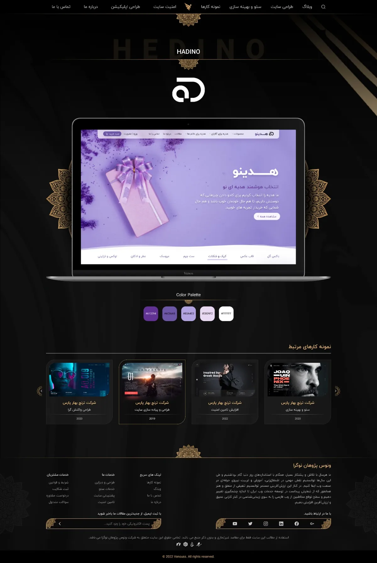
The landing source uses separate desktop and mobile introduction components,
leaving room to adapt layout and motion to the viewport rather than simply shrinking a desktop scene.
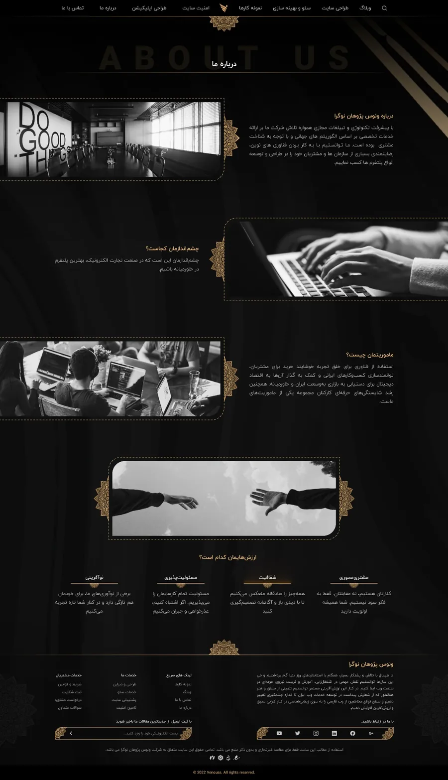
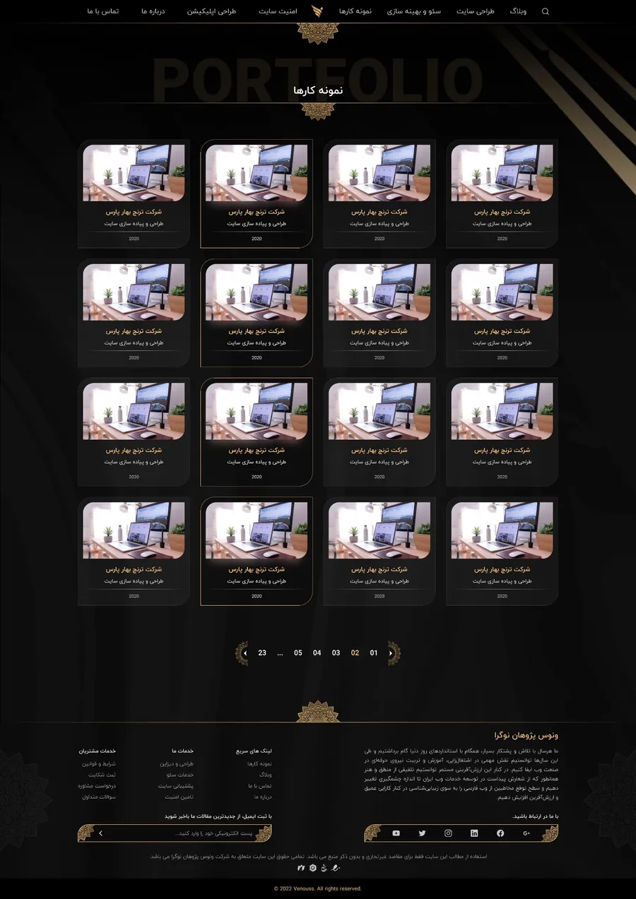
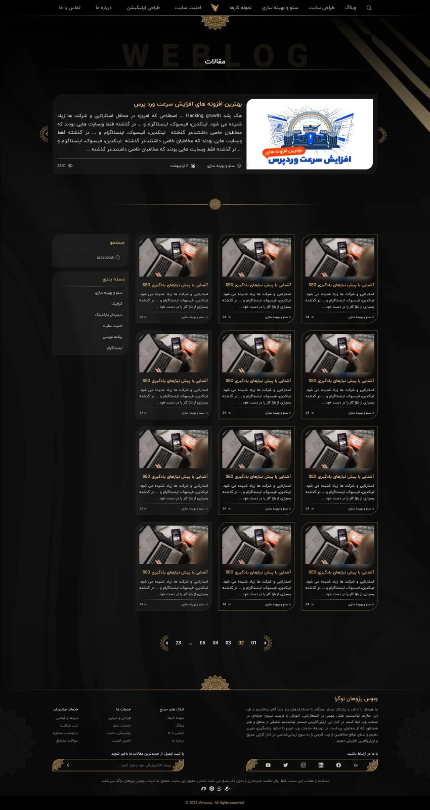
Portfolio, editorial and team views needed consistent cards,
navigation, pagination and detail templates within the same visual system.
The combination of video, decorative imagery and scroll animation made performance a key implementation constraint.
No measured performance improvement is claimed.
The original landing screen used a video asset inside its scroll sequence. This optional short excerpt shows that asset itself; it is not a recording of the full interactive scroll behavior.
The codebase includes separate mobile and desktop components for the landing introduction. That separation offered room for viewport-specific structure where a heavily animated desktop presentation would otherwise be difficult to adapt.
The original mobile landing capture is included at archival quality. The source also contains dedicated mobile and desktop landing components.
